Color Theory for Outfit Pairing

Introduction
Color theory isn't just for painters and designers — it's the foundation of great outfit coordination. Understanding how colors relate to each other on the color wheel transforms random wardrobe picks into intentional, harmonious ensembles.
Complementary Colors
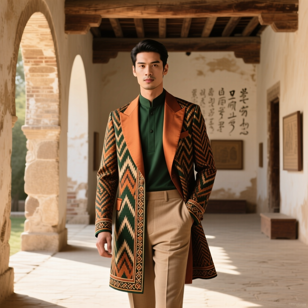
Colors opposite each other on the color wheel create maximum contrast and visual energy. Blue with orange, purple with yellow, red with green. In clothing, use complementary pairs in unequal proportions: a navy suit with a burnt orange pocket square, not equal amounts of both.
Analogous Colors
Colors adjacent on the wheel — blue, blue-green, green — create harmonious, low-contrast outfits that feel cohesive and calm. This is the easiest scheme to execute: a teal blouse with forest green trousers and olive accessories feels effortlessly put-together.
Neutrals as Anchors
Neutral colors (black, white, gray, navy, beige, camel) serve as anchors that allow brighter colors to shine. The 60-30-10 rule works well:
- 60% neutral: trousers, jacket, or dress as the dominant piece
- 30% secondary color: shirt, sweater, or scarf
- 10% accent color: shoes, bag, jewelry, or pocket square
Seasonal Color Analysis
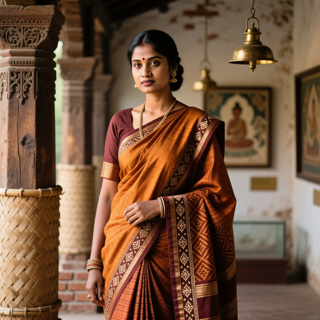
While personal coloring (skin tone, hair, eyes) influences which specific shades flatter you most, the principles above apply universally. A warm-toned person might choose olive-camel-rust (analogous warm), while a cool-toned person might prefer slate-lavender-plum (analogous cool).
Conclusion
Mastering color in dressing doesn't require an art degree. Start with one color relationship — analogous is the most forgiving — and build confidence from there. Great color coordination is the fastest way to elevate simple garments into standout outfits.